
Personalizing Content for
Policy Professionals
The Basics
Project Responsive desktop site
Role UX Designer
Company POLITICO
Tools Sketch, Invision, Hotjar, In-person user testing
Introduction
POLITICO’s subscription service, POLITICO Pro, is a B2B platform that serves the needs of policy professionals. Users were accustomed to receiving POLITICOs content through their email and the product team wanted to reimagine POLITICO Pro’s desktop experience as a destination for users.
Goals
Make the site more “sticky” for users and help to gradually move them away from email-only interaction with the Pro subscription.
Promote discovery of Pro content and tools
Help build an information as a service platform identity for the POLITICO Pro brand
Research & Competitive analysis
I took a look at our direct subscription competitors to understand their offerings, but also drew inspiration from a variety of news sites (anything from Washington Post to ESPN) or sites with exceptionally addictive behavior (Facebook, Instagram, etc.)
I deployed hotjar on our current desktop experience. Through those insights, I was able to analyze click tracking videos and heat maps to see where there might be room for improvement.
The original business hypothesis was that we needed to give our users content with strong personalization and customization while bringing together all the services that Pro offers in one place. This might be a dashboard of widgets for each type of tool we provides or an alert center for all the pieces of information they track.

Initial wireframes
User Testing & Prototypes
I deployed an email and on-site survey to users to gather feedback about their current and desired user experiences on our homepage. I also gathered feedback from account managers in our sales department since they interact with our subscribers on a daily basis. Lastly, I conducted in-person moderated user testing. I took an invision prototype to our users and had them walk through the site. Luckily, this testing validated many of our assumptions and exposed small areas of confusion that we can improve upon.
Conclusion
Through testing it was concluded that less is more when it comes to options. Users seemed to be looking for more personalization of their content, not necessarily wanting ultimate control to customize every bit of their page. Siloing news from alerts was also tedious for users to have to go to multiple places to find what they were looking for. The conclusion ended up being quite simple based on preliminary research but we settled on providing users with a personalized feed that would incorporate news about topics they’ve expressed interest in and alerts on our data based tools they may follow. With extremely complex and varying subscription types, the idea of an all-in-one feed was flexible to suit the smallest accounts and exciting enough for our larger and more complex accounts.
Design & Iterations
Challenges
POLITICO Pro’s subscription model varies based on account. Some users may have access to many tools while others have access only to our news. Any new approach will have to accommodate both extremes.
The cadence of our news and data alerts strongly varies. Especially when layering this on top of what users have access to, it was an intense challenge to find a solution that would be flexible enough to still be useful when more stagnant. The nature of politics means that there could be many updates on legislation one day and none the next. Designs need to be flexible enough for times where .
Not much historical data on the current homepage to base decisions on. The main takeaway is that the homepage is underutilized and disregarded as useful.
Starting the design process
I started with high-fidelity mockups to circulate within stakeholders and technology to ensure we had the data and means to support our ideas.
Based on findings with users, conversations with stakeholders, and input from technology we were able to select the most impactful features for a MVP.
POLITICO already had an established brand and style guideline that was used throughout their public site and throughout the subscription service. Since typography, colors, and icons had been established, we focused our time on site architecture and layout to ensure the website layout didn’t just mimic the public site, but instead served the use cases of our subscribers.
Final designs
Implementation
I worked closely with our technology team to shape our requirements and discover dependencies on other projects in motion.
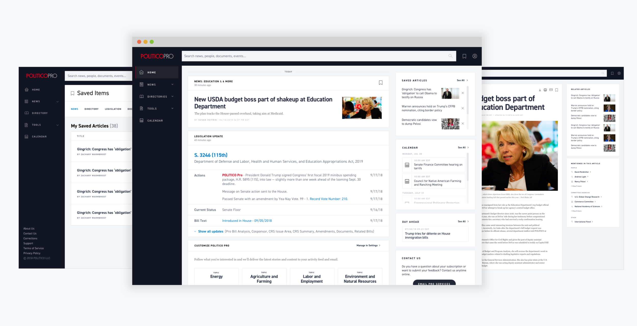
The final designs incorporated a bunch of new features for the POLITICO Pro platform including:
- Enhanced exposed navigation to promote discovery of our products and tools.
- Personalized feed based on user subscriptions. The feed combines content and updates from our news and data products all into one place.
- AI recommendations including topics you might like, related articles, and aggregated articles on popular topics.
- A saved items hub to combine all their saved entities throughout the site.
Results
The redesign was well received by subscribers. They loved the new navigation that exposed important elements like global search and a new saved items page. Traffic to the site doubled and we saw an increase of 30% in site engagement.
The site is behind a paywall, but check out more information on POLITICO Pro’s marketing site.

